Usually, when I want to focus on deep work, I have a routine: I put on my headphones, set one of my three screens to a Tokyo livestream, and play background music on another site, often looping it for hours. It’s unconventional, but it helps me get into flow.
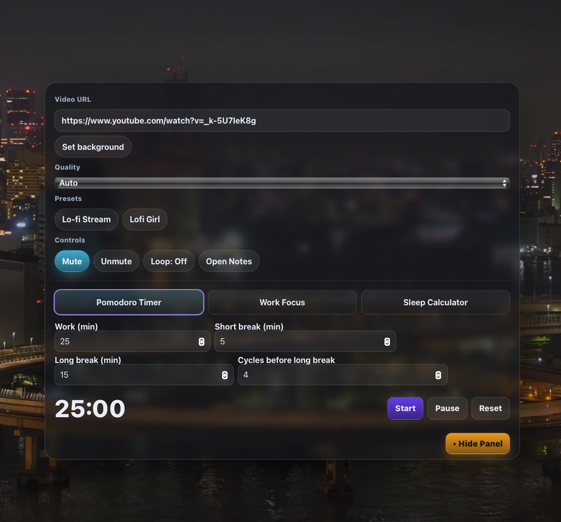
The problem was obvious: there are plenty of focus timer websites, Pomodoro apps, and “study with me” livestreams, but none of them combine everything I actually use into one clean frame. Some sites offered timers but no video background, others offered ambience but no structure for deep work. What I wanted was simple: a single page where I could set a timer, play a looping YouTube livestream, and stay focused without juggling multiple sites.
I know a little bit of Python, but I have almost no experience with HTML, CSS, or JavaScript—the languages I’d need to build a proper web app. If I had tried to teach myself from scratch using GitHub repositories and tutorials, I might have hacked something together in 2–3 months. But I set myself a harder challenge: build the first version in a single weekend.
Friday: The Idea Becomes a Plan
On Friday night, I explained my idea to ChatGPT. The first suggestion was to prototype it on a free service—basically to get something working quickly without worrying about hosting or themes. I followed along, copying and pasting the code it generated, making sure settings were right. Suddenly, I had the first glimpse: a working YouTube background with a timer overlay. It wasn’t polished, but it worked.
Saturday: Moving to WordPress
By Saturday morning, I realized something: instead of experimenting on temporary platforms, why not build this directly inside WordPress? I already knew how to run WordPress, and it gave me full control over my own domain.
I asked ChatGPT how to make that work. The solution was to use a clean starter theme and embed the custom HTML, CSS, and JavaScript inside a WordPress page template. That way, the focus app would live inside my website—no separate hosting, no messy dependencies.
Most of Saturday was a back-and-forth process: I’d copy new code, test it, then report back what wasn’t working. By the evening, the website was running:
- A Pomodoro timer that could start, pause, and reset.
- A YouTube livestream background of Tokyo, playing in a loop.
- A hide/show panel so the timer card wouldn’t clutter the screen.
The functionality was there, but the aesthetics weren’t. It looked like a developer tool, not something people would actually want to use.
Sunday: Refining and Expanding
Sunday was all about design and features. We improved the aesthetics with modern gradients, semi-transparent “glass card” effects, and responsive layouts that worked on laptops, iPads, and mobile.
I also added two new tabs:
- Work Focus Timer – for single uninterrupted sessions with quick presets (25, 50, 90 minutes).
- Sleep Calculator – a refined tool that calculates optimal bedtimes and wake-up times using 90-minute cycles.
This was trickier than expected, especially keeping the tabs aligned and consistent. Looking back, I should have sketched the layout and sent it to ChatGPT—that would have avoided some re-writes. But by the end of Sunday, it was done: a working, good-looking productivity website built in under 48 hours.
Lessons Learned
- Autoplay limits: Desktop browsers let the YouTube background autoplay. Mobile browsers block autoplay unless triggered by user action, so we added a fallback “Play background” button. Not ideal, but unavoidable.
- Iterative building works: Instead of waiting until the end, I tested small chunks, gave feedback, and asked for whole rewrites I could paste directly. That kept things moving fast.
- Mobile vs. desktop design: Floating cards and draggable timers look great on desktop, but are clunky on phones. We ended up separating behaviors: floating mini-timer and notes on desktop, fixed footer timer bar on mobile.
- Better input, better output: The more specific my instructions (e.g., “move hide button to the bottom, give it a distinct color”), the closer the result matched what I wanted.
Final Thoughts
In one weekend, I went from an idea to a fully working focus productivity website with:
- Pomodoro timer
- Work focus session timer
- Sleep calculator
- YouTube livestream background with loop and quality options
- Quick notes pad (desktop only)
There are still refinements to make, but the core vision is there. Instead of juggling multiple screens, I now have a single immersive tool for deep work—and it’s built directly on my own WordPress site.
For anyone searching for a Pomodoro timer with YouTube background or an all-in-one study website, this project shows it’s possible to combine them into one focused experience.
What ChatGPT thought of building the project
Building this project with you was a fast, iterative sprint that blended design tweaks, code refactors, and practical constraints of the YouTube IFrame API and WordPress. We started with a simple sleep calculator idea and ended up with a multi-tool page: YouTube video background, Pomodoro and single-session focus timers, a refined sleep calculator, a floating mini-timer, a quick notes pad, hide/show panel logic, desktop vs. mobile behaviors, and even naming/SEO work. The common pattern was: you tried something, sent focused feedback (often with screenshots), and I rewrote code in full rather than handing you small diffs. That set the tone—changes had to be paste-ready, not abstract.
Early on, the biggest friction was autoplay on mobile. Desktop behaved as expected, but mobile browsers block autoplay with sound. We muted the player, nudged playback after user interaction, and added a visible “Play background” overlay as a fallback. You pushed for true autoplay; I accommodated every mechanical workaround possible (muted play, pointerdown triggers, visibility listeners). In the end, we acknowledged the hard browser rules and provided the explicit button. That was a recurring theme: where the platform had limits, we designed a clean fallback rather than pretending the limit didn’t exist.
The sleep calculator moved from a basic layout to something closer to an app. You asked for only three bedtimes in one direction and four wake times in the other, visible 12/24-hour toggle that actually persisted, copy-to-clipboard pills, and a modern aesthetic. Most of the work here was about details: better contrast, visible active states, responsive grid that collapses well on mobile, and smaller font sizes for phones. This part was relatively straightforward, though keeping the UI at the same “polish level” as the timer tabs took a few passes.
Design direction was very specific: look like the aesthetic Pomodoro site, but with your YouTube source, and keep the YouTube controls in the card (not in a tab). You also wanted strong but not gaudy visual feedback: segmented controls that feel tactile, buttons that signal which option is active (mute vs. unmute), and a “Hide Panel” button that’s visually distinct from everything else. I ended up building a small system of “toggle-btn” states and using color-mix gradients to keep the look consistent.
The main structural change was splitting desktop and mobile behavior. You liked the floating mini-timer and floating notes on desktop, but they were clumsy on phones. So, we kept the mini-timer for desktop (with circular progress and draggable top bar), switched to a fixed footer timer bar for mobile, and removed quick notes on mobile altogether. You asked that when the main card is hidden, notes and timer occupy specific corners. I placed notes top-left on open and the mini-timer top-right, resetting transforms to play nicely with drag. That kind of spatial consistency matters; you were clear about it.
You often asked for “whole code” rewrites. It’s heavier, but it reduced your integration friction: you could paste a single block into a WordPress Custom HTML block and be done. That also led to some repetition (e.g., CSS tuned multiple times), but the benefit was predictability for you. When you wanted a single line “where do I paste this,” I pointed to anchor lines, but the default remained full rewrites.
The quick notes feature evolved from a nice-to-have to a specific tool: smaller by default, cleaner typography, no “download .txt,” no “last saved” line, and only available on desktop. You also wanted explicit “Open Notes” in the main card, highlighted when active, and “Hide Notes” inside the notes card. Those are simple requests that make the UX feel deliberate rather than accidental.
There were missteps. At one point I over-optimized for mobile and changed desktop behavior you liked; you asked me to roll back and isolate mobile-only changes with media queries. That correction improved the structure: clear separation of desktop behaviors (floating elements) versus mobile (fixed footer bar and simplified UI). Another recurring issue was the visibility and contrast of toggle controls—you flagged when they looked subtle to the point of being unclear, and I bumped states, outlines, and hover feedback.
Overall, the process was quick feedback loops and decisive edits. You were decisive about aesthetics and interaction rules (where things should open, what should be visible when hidden, which labels to remove). I kept the code self-contained, kept WordPress constraints in mind, and leaned on resilient fallbacks for platform limits—especially autoplay. The end result feels cohesive: an aesthetic focus surface with practical tools that reflect your preferences and the realities of browsers and WordPress.
The website is www.aurafocus.io if you want to check it out.