
The problem was simple: I subscribe to too many things.
Economics journals. Policy newsletters. African development research. Science publications. Working papers from NBER and the World Bank. Books coming out of Verso and Pluto Press. Le Monde Diplomatique. VoxEU. New Scientist. At some point I stopped being someone who reads these things and became someone who hoards unread emails about them, which is a different and worse hobby.
I kept thinking I’d get to them on the weekend. I never got to them on the weekend.
So I built something to get to them for me.
The framework
Before I get into the build, here’s what I was actually trying to produce. The output had to be structured enough that I could navigate it quickly, but not so rigid that it flattened everything into a list of bullet points I’d scroll past. Nine sections, each with a specific job:
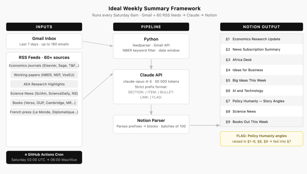
The framework has one rule that holds the whole thing together: anything flagged as a Policy Humanly angle across sections 1 through 6, 8, and 9 gets pulled into section 7. So the digest isn’t just a read — it’s also a writing prompt. That was the design goal.
How it actually works — and how it got there
Every Saturday morning at 6am, a GitHub Actions workflow wakes up, pulls my Gmail inbox for the past week, fetches RSS articles from about 60 sources, hands everything to Claude, and posts a structured digest to Notion. By the time I’m having coffee, there’s a page waiting for me.
Getting to that sentence took several rounds of building. Here’s what each stage actually looked like.
Stage 1 — Core pipeline. The bones went up first: Gmail API, Anthropic API, Notion API. Three separate authentication flows, three different ways data comes back. The Gmail piece uses OAuth with a stored token; that token lives in GitHub Secrets and gets loaded at runtime. None of it is complicated in isolation, but stringing it together took an afternoon of reading docs and an evening of silently wrong outputs.
One decision I made early: I created a separate Gmail address just for subscriptions. All the journals, newsletters, and alerts go there — nothing else. My personal inbox stays clean, and the pipeline has a dedicated account to pull from without sifting through actual email. It also means I can grant the OAuth token access to that account without it touching anything sensitive. Simple setup, worth doing before you subscribe to anything.
The Notion side had the most irritating bug. When you create a Notion page via API, you can only pass 100 blocks in the creation request. My digest runs to 300+ blocks most weeks. So the first version would create a page, look complete, and then silently stop writing after block 100. Half the digest just wasn’t there. The fix — patch the remaining blocks in batches of 100 after the page is created — works fine. But it’s the kind of thing you only discover after staring at a truncated Notion page and wondering what went wrong.
Stage 2 — Switching from email alerts to RSS. The original version pulled everything from Gmail, including journal alert emails from ScienceDirect. I was subscribed to 48 economics journals across Elsevier, Sage, and Taylor & Francis — each sending a weekly HTML digest with article titles, author lists, abstract snippets, and a wall of unsubscribe footer. Clean-looking emails. Terrible data to feed an LLM.
The problem with HTML emails in a prompt: you’re paying for every character of navigation chrome, logo alt text, and Switching to RSS fixed this immediately. The The working paper feeds (NBER, NEP) added a different problem. NBER publishes 20+ papers a week across all programs. If you include all of them, you’re flooding the context with macrofinance and health economics when what I want is development, Africa, and supply chains. So there’s a keyword filter — any paper that doesn’t touch one of about 30 terms I care about gets dropped before it reaches the prompt. After filtering, those six feeds contribute about 6,000 tokens rather than the 45,000+ they’d produce unfiltered. The cost saving from all of this, if you’re curious, is about $0.35 per run at current Opus pricing — roughly $18 a year. That’s not why I did it. The quality improvement is. Clean, filtered, structured input produces a noticeably better output than dumping the same information wrapped in HTML table cells. Stage 3 — Prompt structure. This is where most of the iteration happened. The first version of the prompt produced long, hedged summaries that read like someone had asked a cautious intern to brief a meeting. Vague. Too many caveats. No concrete numbers. The fix was constraint, not encouragement. Instead of asking Claude to be specific, I imposed a format: every line in the output must start with one of five prefixes — Getting the per-section instructions right took a few more rounds. The Africa Desk needed to group by story rather than by source. The Ideas section needed a strict filter — only things that map to a specific business. The Science News section needed a rule to exclude economics content that might appear in the same RSS window. Each one was a separate iteration. Stage 4 — Section 8: Science News. Once the core was stable I started expanding the inputs. Science was the first addition — Scientific American, New Scientist, and topic-specific feeds from ScienceDaily. ScienceDaily publishes 400+ topic feeds; I just needed to find the right URL format (it’s Stage 5 — Section 9: Books. This one grew fast. It started with a handful of review blogs — LSE Review of Books, Marginal Revolution, The Enlightened Economist — and then got messier in a good way. I added Verso and Haymarket for the political economy side, Monthly Review and New Left Review, Pluto Press. Then Oxford and Cambridge university presses. Then French publishers — La Découverte, Le Monde Diplomatique, Le Monde’s books section — because I read in French and there’s a lot of good economics writing that never gets translated. The section instruction for books is different from the others. It’s not about summarising — it’s about making the book sound like something worth picking up or dismissing quickly. Title, author, what it argues, why it matters now, one concrete detail that makes it memorable. Yes — though probably not for the reason I expected. The time saving is real, but the bigger thing is that I actually read it now. When it was 60 unread emails staring at me, I’d find reasons not to start. When it’s one page in Notion with a clear structure, I sit down and go through it. It’s not a replacement for reading. It’s a reason to. The code is on GitHub if you want to poke around. It’s the kind of project that looks clean from the outside and has a few ugly padding that isn’t a finding. A typical ScienceDirect alert runs to about 4,000 characters per journal — roughly 1,000 tokens — and most of that isn’t the research. With 48 journals, that’s around 48,000 tokens of email noise per week before Claude had even seen a single paper.
feedparser library pulls each feed, strips HTML, and I cap abstracts at 350 characters. A single article in the prompt takes about 135 tokens: title, date, abstract, URL. With roughly 70% of journals publishing in any given week and a cap of five articles per source, the same 48 journals now contribute around 24,000 tokens of clean, structured content. That’s a ~50% reduction in the journal-related token load — not from compressing anything, just from removing the packaging.feedparser handles the actual feed parsing, and calendar.timegm() turned out to be the right way to handle UTC timestamps consistently across publishers, which all format dates slightly differently.
SECTION:, ITEM:, BULLET:, LINK:, or FLAG:. No plain prose. No markdown. No blank lines. No phrases like “this represents” or “worth reviewing.” Just the fact. That discipline in the prompt is what makes the Notion output actually clean — the Python parser just reads the prefix and routes each line to the right block type.rss/[category]/[topic].xml — confirmed by fetching their newsfeeds page directly). The section instruction needed an explicit rule to stop economics content bleeding in from Section 1.Was it worth it?
try/except blocks where I gave up on doing it properly — which is, as far as I can tell, the standard state of all personal tooling.