Updating My Focus Timer Website – Because It Needed It
A few months ago I built AuraFocus in a weekend. If you read that post, you know it was a scrappy sprint — me, Claude, a lot of trial and error, and something functional at the end of it. I was proud of it, but I also knew it wasn’t done. It just worked well enough to ship.
Since then I’ve been using it myself, and a few things started bothering me. Not in a “this is broken” way — more in a “this is just a bit clunky and you know it” way. So I sat back down and did a proper round of updates. Here’s what changed and why.
Why update?
Honestly, the original version had too much going on. There was a sleep calculator, a study timer, a full live preview of the focus room on the homepage — features I built because I could, not because they made the product clearer. When I’d show it to someone and they’d say “wait, what does this do?” I knew I had a problem.
The goal this time was simpler: make the thing feel obvious. If you land on the page, you should know within five seconds what AuraFocus does and how to start using it.
What changed
The biggest cuts were the sleep calculator and study timer. Gone. They were pulling the product in two directions — is this a focus app or a wellness toolkit? Focus app. Done.
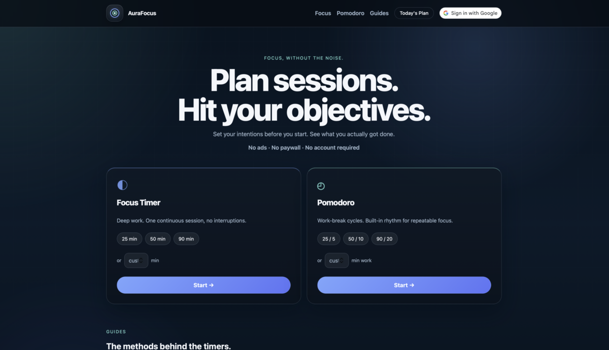
The homepage got a full rethink. It’s now just two mode cards — Focus Timer and Pomodoro — with preset durations and a custom minute input. You pick your time, you click Start. That’s it.
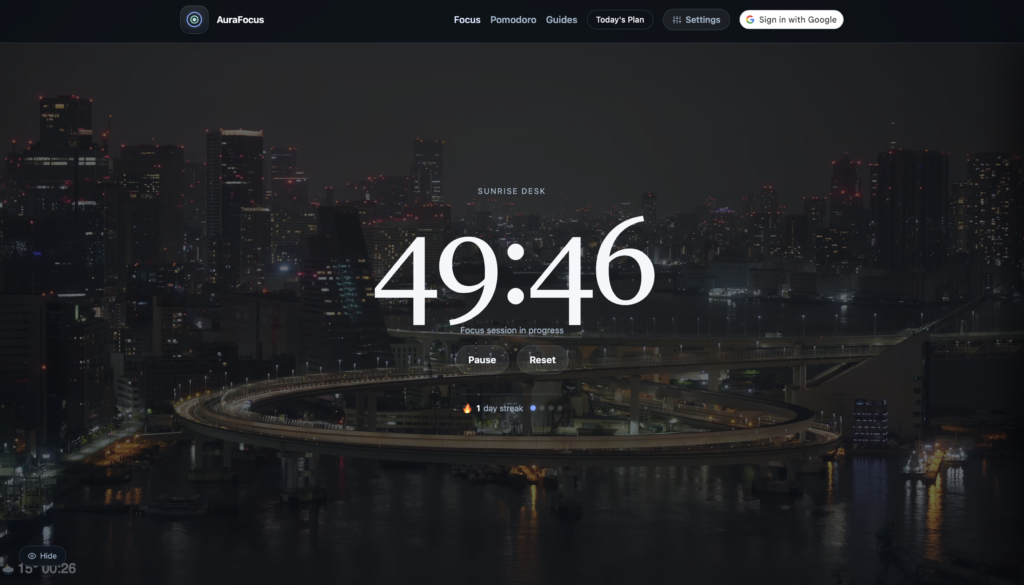
The session planner got the most attention. In the old version it was this inline panel on the homepage that would expand and push all the content down. It felt awkward. Now it’s a slide-in drawer, accessible from the nav on every page. You can add sessions, set objectives for each one, and when you click Start on a session, your objectives actually show up on the timer page while you work. That one felt genuinely useful to build.
I also added Google Sign In. This was something I’d been putting off because auth always sounds intimidating — but with the Google Identity Services library, it ended up being pretty clean. You sign in once and your name and photo show up in the nav. Nothing fancy, just a bit more personal.
Hurdles
The main one: Google Sign In doesn’t work on localhost unless you’ve explicitly added it as an authorised origin in Google Cloud Console. So during testing the button would just sit there doing nothing — no error, no feedback. Spent longer than I’d like to admit figuring that one out.
The other annoyance was the local dev server kept picking up a config file from a parent folder and serving the wrong project entirely. Not an AuraFocus problem, just an environment headache.
Final thoughts
The site feels more like a product now and less like a weekend experiment — which I suppose was the point. Still free, still no account required, still no ads. Just a cleaner version of the same idea.
You can check it out at aurafocus.io.